
Headshot Background: A Practical Guide For LinkedIn, Teams & Enterprise Rollouts
Your headshot background is a business decision, not a decoration. It quietly shapes how people read your presence before they notice your expression, your posture, or the quality of your jacket. For the professionals and teams we photograph at Match Production, that background will live on a LinkedIn profile, a company website, a pitch deck, internal directories, and press materials. It needs to work across all of them.
Choosing a headshot background that aligns with your company’s brand is essential for projecting a consistent and professional image. A good background for a professional headshot not only enhances the subject’s brand but also prevents the image from feeling outdated.
Companies with consistent brand presentation see a 23-33% increase in revenue compared to those with inconsistent branding, and over two-thirds of businesses surveyed linked brand consistency to at least 10% revenue growth. Additionally, 90% of consumers expect a consistent experience across different platforms, making uniform headshot backgrounds crucial for conveying professionalism and attention to detail.
There is no single best background for professional headshots. But there are proven choices for NYC corporate, executive, and remote headshots that hold up across contexts. We shoot in our Midtown studio near Times Square, on location in client offices across Manhattan and the boroughs, and via live-directed remote sessions for distributed teams.
That range means we see how different backgrounds behave in the real world, from tiny LinkedIn crops to full-page annual reports. In headshot photography, the choice of background plays a key role in conveying trust, professionalism, and brand consistency—whether you opt for classic navy blue, custom branded backgrounds, or something more neutral. Warm tones like beige and taupe are especially effective for roles where approachability is more important than authority.
This guide covers specific background types, how they read in different industries, and how we standardize them for teams and enterprise programs. The goal is to help you create a great headshot that captures both professionalism and personality, and you can dive deeper into business headshots for personal and corporate branding if you’re planning a broader refresh.
Introduction to Professional Headshots
A professional headshot is not simply a photograph—it is the cornerstone of executive presence and the decisive factor in commanding first impressions. Whether you are updating LinkedIn profiles, refreshing company leadership pages, or building personal brand architecture, the background you select for your headshot becomes the foundation that either elevates your professional authority or undermines it entirely.
From precision-controlled solid backgrounds to carefully composed environmental settings, each choice carries specific visual weight and communicates deliberate messaging about the subject's positioning. Selecting the optimal background can overwhelm executives who lack technical expertise, but understanding how different backdrop choices influence perception and brand alignment will empower you to commission a headshot that reads both authentic and uncompromisingly professional.
In this technical guide, we dissect the most effective professional headshot background systems: their optical characteristics, brand implications, and selection criteria for maximum impact—ensuring your portrait commands respect and performs flawlessly across every platform where it appears.
How Backgrounds Shape First Impressions In Professional Headshots
Background is the second thing people notice after expression, and it silently sets the tone. Conservative, modern, creative, approachable. The backdrop whispers before you speak.
On LinkedIn and company websites, your headshot must survive tiny circular crops, dark mode displays, and side-by-side grids with colleagues. Solid colors and neutral backgrounds hold focus at small sizes. Busy patterns turn to noise.
Darker backgrounds generally read more polished for finance, law, and senior leadership roles. Softer or warmer tones help in client-facing and people-centric positions where approachability matters as much as authority.
Your headshot background should support the type of work you do and complement your skin tone, clothing, and eye color—a mismatch can confuse viewers or lead to unnecessary retakes.
For HR, PR, and employer brand teams, a mismatched set of backgrounds across a leadership page can visually undermine consistency and trust. Studies suggest inconsistent color use reduces brand recognition by up to 80 percent. Even if every individual image is strong, alternating white, outdoor, and textured backdrops makes an executive team look disorganized.
Our production approach starts with a simple question: what does this image need to say about you? Then we choose and light the background to support that message.
How Backgrounds Work
In professional headshots, the background is never just wallpaper—it's the silent partner that either makes or breaks your entire image. The right background doesn't just fill space behind you; it orchestrates the whole frame with your lighting, wardrobe, and expression to deliver a headshot that commands attention for precisely the right reasons.
A strategically chosen background becomes your visual ally: subtly sculpting your features, harmonizing with your skin tone, and pulling focus exactly where it belongs—on you.
The Psychology of Backgrounds
Whether it's that perfect neutral gray that flatters every complexion we've shot, a soft gradient that adds editorial depth, or a precisely controlled office blur that whispers professional credibility, the background builds context and authority in every pixel.
Clean vs. Cluttered Backgrounds
Clean, intentional backgrounds project the kind of attention to detail that reads "executive level," while cluttered or competing elements can sabotage even the strongest presence. In our digital-first world where headshots live in thumbnail formats—LinkedIn grids, company leadership pages, social feeds—the background's contrast and clarity become make-or-break elements for that crucial first impression.
Amplifying Your Brand
The most effective backgrounds work when they amplify your personal brand, not compete with it. We approach every shoot with this principle: the background is a strategic tool that reinforces your message, never overwhelms it.
Master this relationship between subject and setting, and every headshot you create will deliver the kind of lasting, professional impact that opens doors and builds trust.
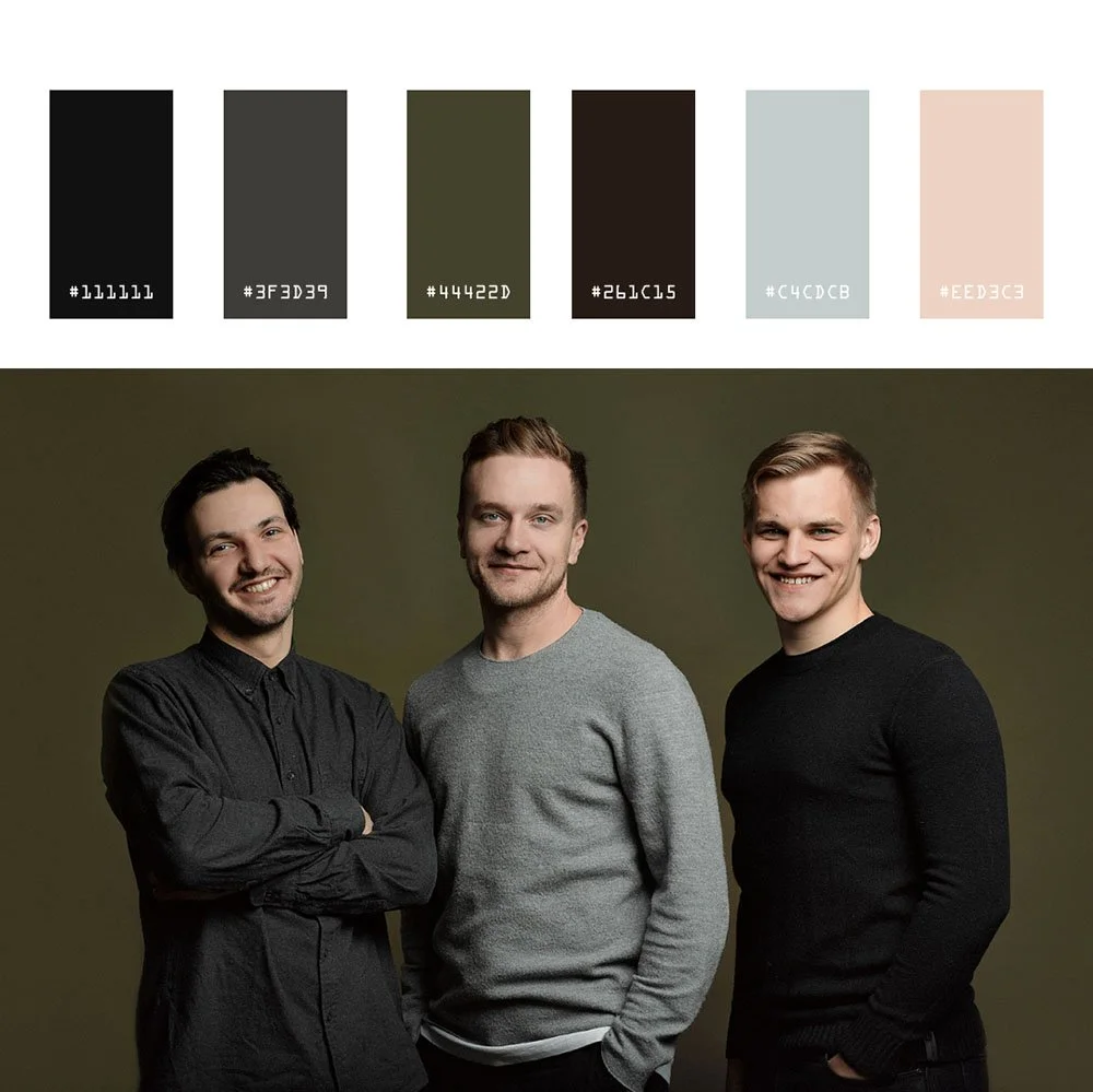
Studio Backgrounds We Use Most Often (And When They Work)
Studio backgrounds are the default for many NYC corporate and executive clients because they are controllable, repeatable, and portable across future hires. When you add someone to the team in six months, they can match the existing system without visual drift.
Light Gray
Light gray is our most popular and versatile professional headshot background, suitable for every skin tone and industry, making it a safe choice for corporate headshots. A gray background offers exceptional versatility and control in studio setups, making it ideal for consistent lighting and color management across sessions.
It works across skin tones from fair to dark, translates well across industries, and holds up on LinkedIn, bios, and investor decks. We reach for it when photographing mixed teams without a mandated brand color. It reads neutral, sophisticated, and professional without calling attention to itself.
Gray backgrounds communicate neutrality, formality, and sophistication, which is why financial institutions and law firms often favor them. Research from the University of Winnipeg found that people form judgments within 90 seconds of seeing someone, and 62-90% of that assessment is based on color alone. Additionally, a study published in the Journal of Marketing & Social Research found that blue backgrounds triggered associations with trust in 74% of participants and competence in 68%.
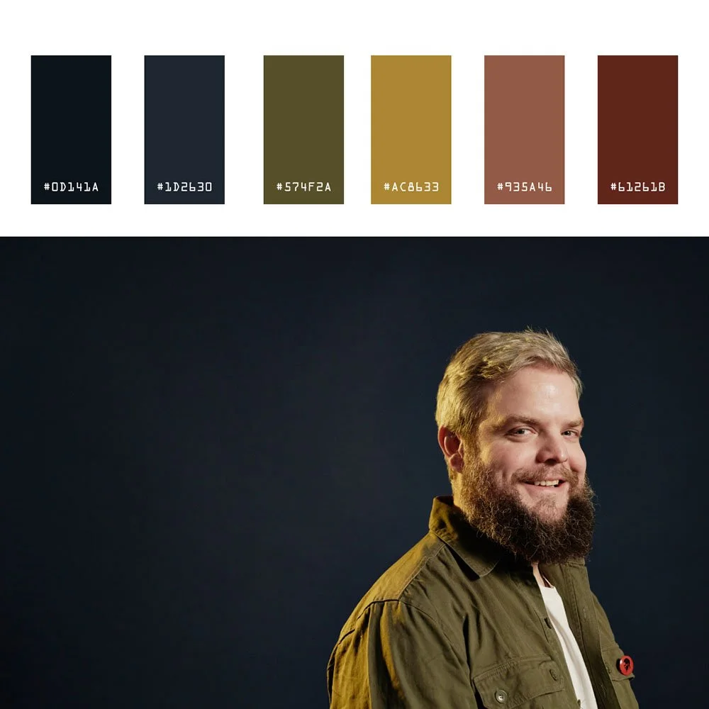
Charcoal and Dark Gray
Charcoal and dark gray add gravitas for executives, board members, and leadership portraits. These backgrounds print sharply in annual reports and look strong in conference programs.
The depth creates enough contrast to frame the subject without overwhelming them.
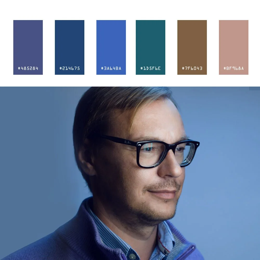
Navy Blue
Navy blue works especially well for finance, consulting, law, and enterprise technology. It reads as stable and trustworthy and sits naturally behind navy suits.
Navy blue is favored in finance and law for its trust-building qualities, making it a strategic choice for firms in these sectors. For teams that need side-by-side consistency across a leadership page, navy provides visual interest without distraction.
White Background
White background and near white backgrounds are reserved for tech, healthcare, and ERAS-style requirements, or when the design team needs a very clean asset for web layouts. White backgrounds signal clarity and premium quality, making them a common choice for healthcare providers and government agency headshots.
We usually warm it slightly so it does not feel clinical. Pure white requires dedicated backlight to avoid shadows and can wash out fair skin tones if not handled carefully. Off white and other light, warm tones—whether in backgrounds or clothing—can provide a softer, more inviting look compared to pure white, improving contrast and approachability.
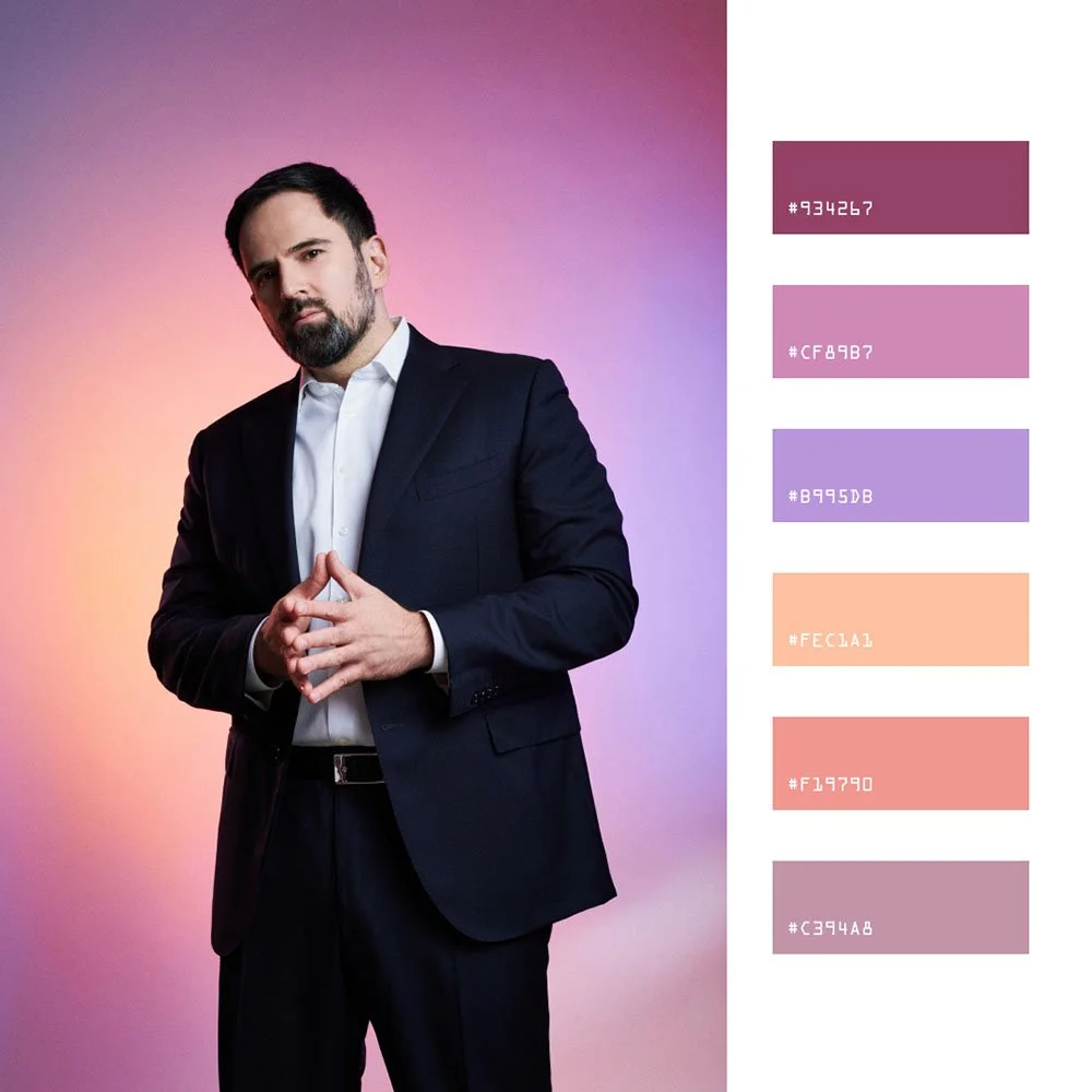
Soft Gradients
Soft gradients have become a modern standard for company-wide headshots and executive portraits. We often light a gray or navy seamless to create subtle depth and texture without visible lines.
The effect feels polished and contemporary, adding dimension while keeping the focus on the person.
When a solid color or background that stays modern is needed, a flat background can be created in post-production, allowing for customizable and natural-looking scenes or easy digital replacement.
Textured Backdrops
Textured backdrops like painted canvas or brushed concrete add depth without being distracting in headshots.
Environmental & Outdoor Backgrounds: When Professional Headshots Leave The Backdrop Stand
Not every professional headshot needs a seamless roll. An environmental background—a real-world setting such as an office, urban space, or outdoor location—can provide valuable context and storytelling for professional portraits, especially when the setting reflects the subject’s role or brand.
Office and Workplace Environments
Office and workplace environments let us photograph in glass conference rooms, executive suites, and common areas across Midtown and downtown Manhattan. The choice of space—whether it’s a modern office, a collaborative co-working area, or a distinctive conference room—conveys credibility and context for the subject, and on-location corporate headshots in NYC offices are often the fastest way to achieve that at scale.
Blurred city views, bookcases, and architectural elements suggest a real company in a real office. We control depth of field with a wide aperture to keep the subject sharp while the background adds context without distraction.
Lobby and Cityscape Looks
Lobby and cityscape looks work well for founders, real estate agents, and visible executives who want a New York energy without looking like a tourist shot. These environmental backgrounds are especially effective for client-facing roles in service industries such as real estate, hospitality, or consulting, where context and credibility are key.
We use shallow depth and careful framing to blur the city into a soft wash of tone and light.
Outdoor Background and Natural Settings
Outdoor background and natural settings sessions happen on rooftop terraces, parks, or quiet side streets when a more relaxed, approachable, or personal branding tone is needed. These natural, outdoor environments create an authentic look that can make subjects appear more approachable and genuine.
Strong background blur and clean sightlines keep it professional. Golden hour and bright overcast days give us even illumination without harsh shadows.
Tradeoffs of Environmental Backgrounds
The tradeoffs are real. Environmental and outdoor backgrounds can date faster as office decor changes, skylines evolve, and seasons shift. Coordination becomes harder for large teams across locations.
We often recommend one environmental portrait for PR and speaking engagements, with a simpler studio or digital background for directories and team pages where consistency matters.
Remote & Digital Backgrounds: Consistent Headshots Without Everyone In NYC
We run remote headshot sessions with live professional photographer direction, not self-serve apps or AI filters. Each person uses their phone’s rear camera while we guide them through lighting, posture, and expression in real time. We capture against a neutral wall with controlled window light as part of our broader corporate headshots services for NYC executives and teams.
For most remote sessions, we then apply a digital studio-style background, often the same gray, navy, or gradient we use in our Midtown studio. The result is a team that matches regardless of city or time zone.
Benefits for HR and Enterprise Clients
Easier onboarding for new hires
Standardized appearance for distributed and hybrid teams
Ability to roll out a new background choice across hundreds of people without coordinating travel
Consistency between office production days and remote participants
We match digital backgrounds to the lighting and angle of the original photo so the result feels like a real studio image, not a cut-out. This matters most around hair edges and shoulders, where poor compositing creates halos or jagged lines. We handle post production in Photoshop to refine every edge.
When needed, a professional photographer may add blur—such as using Gaussian Blur—to the background in post-production to focus attention on the subject. However, it’s important not to overdo this effect, as excessive blur can look artificial.
Remote plus digital backgrounds work well for companies with multiple offices, hybrid roles, and frequent new hires. We regularly combine in-office production days with remote sessions to keep backgrounds identical across the organization.
Headshot Backgrounds for LinkedIn Profile
When it comes to your LinkedIn profile, the background of your headshot demands editorial precision: clean, controlled, and technically sound. The optimal background leverages neutral tones—light gray or white—not for aesthetic preference, but for tonal headroom: these hues provide sufficient contrast ratios to separate your features while maintaining color fidelity across LinkedIn's compression algorithms, especially when paired with dedicated LinkedIn headshot photography for NYC professionals.
A controlled, uncluttered background ensures visual hierarchy remains locked on the subject, not environmental distractions. Avoid busy patterns, outdoor variables, or compositional elements that fragment attention—these compromise professional credibility and reduce impact across digital platforms.
Working with a photographer who understands lighting control, color management, and medium format capture ensures your headshot delivers: sharp focus, controlled lighting ratios, and composition engineered to highlight executive presence. The right background, paired with professional lighting architecture and calibrated color workflow, creates a polished portrait that holds detail through LinkedIn's circular crop and projects confident, credible authority in any business context.
Matching Backgrounds To Industry & Role
Choosing the right professional headshot background is essential for setting the tone and communicating professionalism, trust, or authority depending on your industry and role. What works for a CFO will not always be right for a creative director or therapist. We advise clients differently by field and role.
Industry-Specific Background Recommendations
Skin tones also factor into the decision. Darker tones thrive on navy, deep teal, or warm charcoal for contrast. Very fair skin and white shirts often benefit from slightly darker or warmer backgrounds rather than pure white. We match background to both industry and individual during every session.
Team & Enterprise Headshot Programs: Keeping Backgrounds Consistent At Scale
Background is a brand-standard decision. Aligning headshot backgrounds and styles with the company's brand identity is essential to convey professionalism and reinforce your brand values. Once chosen, it becomes the visual thread across your careers page, press releases, leadership decks, and social media presence.
We establish one or two approved backgrounds per client and document them in a simple style guide. A common structure: light gray for staff, charcoal gradient for executive leadership. This keeps the company’s brand visually cohesive without requiring every person to photograph beautifully against the same single color.
On a typical office day in Manhattan, we photograph dozens to hundreds of people on the same background using identical lighting. Our enterprise programs support up to 500 professionals per day. New hires photographed six months later drop into the existing system without visual drift, mirroring the scalable approach we use for team headshots and corporate group photos in NYC.
For larger enterprise programs, we combine office days in NYC with remote sessions for other regions, then apply the same digital background across all participants. The match is seamless. HR and design teams get a unified image library regardless of where people sit, supported by our NYC headshots for corporate teams and distributed offices.
We recommend involving employer brand, marketing, and communications in the background decision early. The same photo will appear in org charts, investor decks, and recruiting materials. Getting alignment upfront prevents rework later.
Choosing Backgrounds For Executive Portraits & CEOs
CEO and executive portraits serve more uses than standard staff headshots: annual reports, speaking engagements, media placements, and internal communications. The most important element is versatility, which is why many clients invest in dedicated executive and CEO portrait sessions in NYC.
We recommend two to three primary background options for executives:
Charcoal or navy studio for formal corporate use and investor materials
Refined gradient for modern depth without distraction
Controlled environmental setup such as a corner office or boardroom with city in soft focus
Plan one formal background that aligns with the corporate site, plus an optional second, more relaxed option for interviews, LinkedIn, and thought leadership pieces. We build in enough time during executive sessions to explore both a clean studio look and a subtle environmental frame.
Executives who serve on multiple boards sometimes need neutral, non-branded backgrounds that work across organizations. We prioritize that flexibility in the setup so the same portrait serves multiple contexts.
Custom Branded Backgrounds
Custom branded backgrounds are not decorative afterthoughts—they are strategic tools that lock your headshots into your company's visual DNA and operational values. We build backgrounds that integrate your brand palette, logo elements, and signature aesthetic so every portrait reads cohesively across your website, social platforms, and marketing pipeline.
This visual consistency does more than reinforce brand recognition; it ensures your team's headshots command attention from clients, partners, and top-tier recruits who know quality when they see it.
Branded backgrounds work best when they are precise: a controlled color temperature that matches your brand spectrum, a soft gradient that holds texture without competing, or bold visual anchors that immediately connect every frame to your company identity.
This is not a preset package or generic backdrop solution. Investing in professionally designed branded backgrounds means every headshot we deliver amplifies your broader brand narrative and cuts through the visual noise of a saturated digital marketplace.
Coordinating Wardrobe, Skin Tone & Background Choice
Background cannot be chosen in isolation. Clothing and complexion determine whether a color feels flattering or flat.
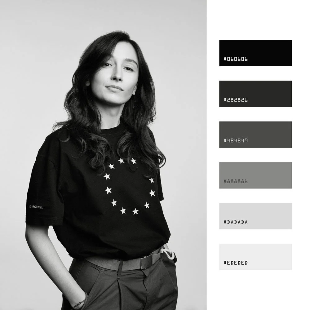
Avoid exact matches between jackets and backgrounds. Black jackets on nearly black backgrounds cause the person to visually melt into the frame. There needs to be enough contrast to separate subject from backdrop.
Very fair skin and white shirts benefit from slightly warmer backgrounds, like light gray or soft neutral tones, rather than pure white. Pure white can feel clinical and create an overexposed impression.
For darker skin tones, rich mid-tone backgrounds like navy, deep teal, or warm charcoal hold contrast without overexposing the face. These create clean lines and a sense of depth in the final image.
We routinely review wardrobe choices on set or at the start of a remote session. If something clashes, we adjust the planned background to better support the person in front of us.
Headshot Background Mistakes We Help Clients Avoid
Many people arrive with phone photos taken against busy bookcases, kitchen walls, or virtual meeting backgrounds that undermine their professional image.
Cluttered or literal backgrounds. Messy offices, crowded shelves, and visible signage pull attention away from the face. They also date quickly. That motivational poster will feel distracting in two years.
Trendy or novelty looks. Brick walls, bright patterns, and heavy color casts feel stylish for one season and awkward later on a corporate site. Stick to solid colors and flat backgrounds that stay modern.
Mixed team backgrounds. Alternating white, outdoor, and textured backdrops makes a leadership page look disorganized, even when every individual picture is strong. Consistency builds trust.
Low-quality virtual or AI cut-outs. Halos around hair, jagged edges, and mismatched lighting make a headshot look amateur. The gaussian blur and subject extraction need careful work in Photoshop to avoid the obvious tell-signs of poor compositing.
We simplify these choices so internal teams do not have to art-direct every decision themselves.
Best Practices for Headshot Backgrounds
Choosing the right background for your headshot is about visual authority: creating an image with depth, clarity, and the kind of presence that reads professional in any context.
Start with background color that complements your skin tone and wardrobe, but understand this: neutral shades like gray, white, and black are reliable choices because they hold detail and maintain color fidelity, while carefully chosen bold colors can add personality without compromising the tonal range your image demands.
Consider the texture of the background with purpose: a flat background offers that clean, modern editorial look, while subtle textures introduce depth and visual interest without competing with the subject for attention.
Lighting control is everything here—well-lit backgrounds don't just set tone, they separate you from the field and ensure your presence commands the frame. We build backgrounds that enhance the overall image, provide the contrast ratios that make you stand out, and maintain that executive-level professionalism whether we're shooting in studio or crafting the perfect setup on location.
Shortcuts in background choice show up in every context where your image matters.
Post Production and Editing
The work doesn't end when the camera stops clicking—that's where the real craft begins. Post production and editing separate competent headshots from portraits that read professional in any context.
After the shoot, a skilled photographer reviews every frame, selecting only the strongest captures and refining them through precision editing. This process demands more than basic adjustments: color balance that holds true across digital and print, contrast ratios that preserve detail in dark suits and bright collars, and sharpness that maintains skin texture without artificial enhancement.
Techniques like Gaussian blur become surgical tools: creating that shallow depth of field that punishes amateur work, subtly isolating your subject from distracting backgrounds while maintaining natural bokeh.
This isn't just separation—it's intentional depth that gives executive portraits their editorial authority. The difference between a decent headshot and one that commands attention lies in trusting a photographer who understands that post production is where professional standards are either met or compromised—whether that final image lands on LinkedIn, anchors your company's leadership page, or represents your personal brand in high-stakes contexts.
How We Help You Select The Right Background (Studio, Office & Remote)
Our process starts with a conversation about use cases, brand, and industry. Then we make a concrete recommendation instead of presenting a confusing menu of twenty colors.
Our Step-by-Step Process
NYC Studio Sessions:
We pre-select one to three background options based on your field and share example images so there are no surprises on shoot day.
Light gray, charcoal, navy, gradient. We arrive with a clear plan.
On-Location Shoots:
We arrive early to test angles in the office, pick a repeatable setup, and run everyone through the same lighting and background.
We adjust only when role or seniority requires a variation.
Your photographer handles the camera work, the key light positioning, and the frame. You handle showing up.
Remote Sessions:
We confirm the chosen digital background in advance.
Direct each person into good natural light against a neutral wall.
Capture the image with portrait mode precision, then apply the approved background and retouch for a studio-level finish.
We encourage treating background as part of a broader headshot standard, not a one-off choice. Whether you need professional photos for a 10-person team or a multi-city enterprise program, we are happy to help create that standard and maintain it across hires and updates.
Send us a note at hello@match-production.com with your team size, timeline, and goals. We will take it from there.